

Class Project
RapidGrosh
BRIEF
Grocery shopping is time consuming, frustrating, and hard to manage. Design a solution to alleviate customers' frustrations and further reduce their time spent grocery shopping.
MY ROLE
UX researcher, UI designer
TIME
Fall 2023, 5 weeks
TEAM
Yilin, Luke, Rokhaya, Alina
Retail
Product Design
TOOL
Figma (UI&UX Design), Adobe Illustrator (LOGO Design)
Procreate (Quick Iteration & Illustration), Miro (Team Collaboration)
Background
Grocery shopping can be a burden in a busy life for people living in a city like New York. Long lines, not being able to cook the ideal dinner because you forgot to buy an ingredient for a recipe, and the difficulty of purchasing all the items at one market make an already busy and agitated life unacceptable.
Problem
Unpredictable Timing
Unexpected long line and waiting time in the markets.

Market Shortage
Failed to find all necessary items in one market.
Duplicate Purchases
Forgetting/repeatedly buying the same item
Solution
Feature #1
Quickly check the available items and waiting time of nearby markets.

Feature #2
Provide recommend markets based on the availability of each items in user’s shopping list.
Remind users of important items in their shopping lists.
Feature #3
Avoid users from buying repetitive things.


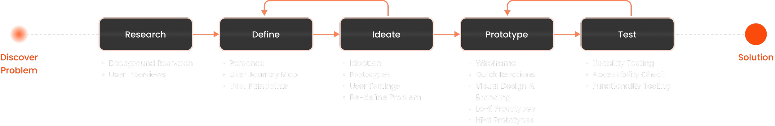
Process
How did we get there?
What are the parts that frustrate users most while shopping?
Challenges in locating the ideal market.
Failed to find important items in the market.
Forget to buy some items.
Long waiting time during check-out.

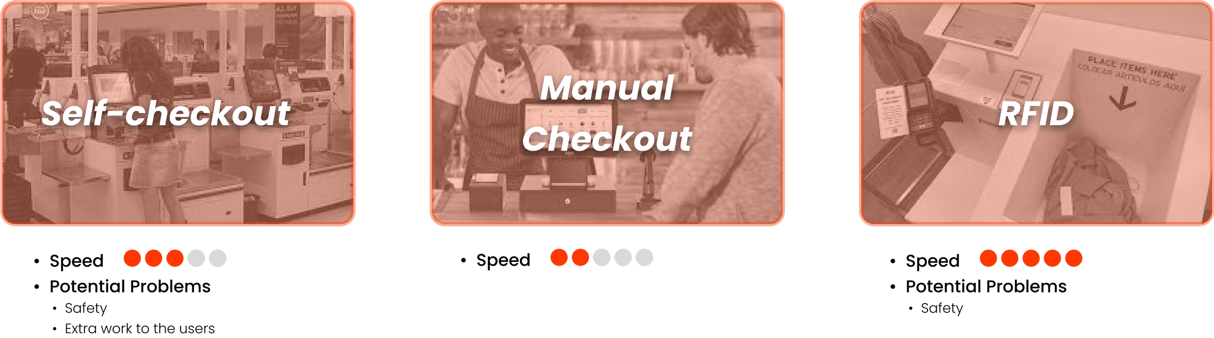
What are the current design and checkout systems of grocery shops?
After interviews, we found that people feel frustration both before and after shopping. We initiated our research by focusing on the aspect that users complain about the most — the checkout process.
We discovered RFID technology is highly efficient in checkout systems.
How might we design to address those problems?
Ideation
We map out all possible functions based on the user’s pain points we've discovered. Subsequently, we evaluate the implementation difficulty and potential problems associated with each function.
In the end, we decide to prioritize enhancing the user experience before shopping in this project.

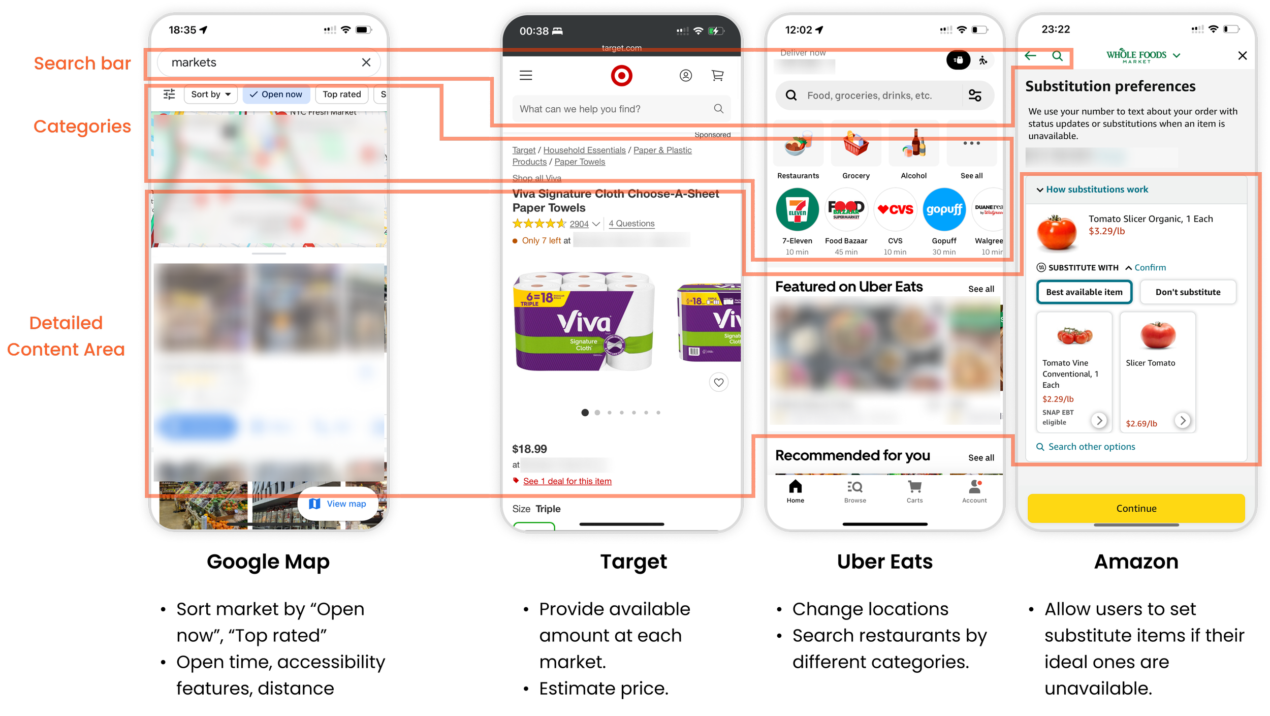
Comparative Analysis
I then analyzed mapping service apps and food delivery apps to better understand:
What key information should we provide to users?
How to display different types of information?
How to streamline user’s pre-shopping journey into a lively and relax process?
Design.
What if we transform the user's pre-shopping experience into an adventure-like journey within the application?
User flow | Information architecture | Wireframe
Design system & Hi-fi prototype
Thinking about features and structure
After several rounds of brainstorming, we group out the main functions with the users we’ve interviewed before.
We all agreed that 'Search nearby markets' and 'Making shopping list' should be the two main functions. Users also appreciate the idea of creating a virtual robot that can accompany their decision-making process.
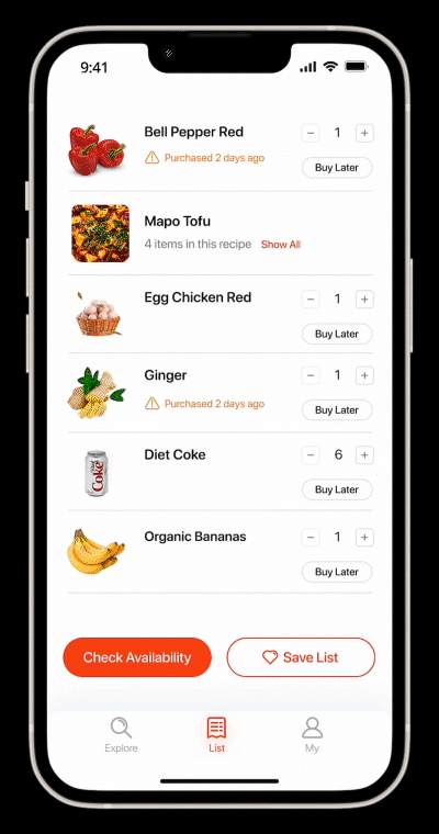
Based on the card sorting results and additional comments given by users, I made this information architecture. The main functions of the app includes:
Add items to list
Check list’s availability
Save lists
After testing the app with four users, I documented their frequent routines and functions in the chart.


Wireframe
To have a better understanding of how to integrate functions into the application and the entire user flow, I created a wireframe for our product.

Visuals
I solely created the visual design for our product. I choose reddish-orange as our theme color. Since I wish the color to bring out the feeling of being energetic and efficient to our users.
I choosed SF Pro Rounded as our font family. This font has high readability. Besides, it’s cute and lively.


I checked different font sizes on special background and grey background for accessibility.

Final Designs

Let me, GroBot, help you begin today’s grocery shopping journey!
Key Takeaways
Cross-functional team collaboration: Working with students in different majors is not an easy task. I learned how to discover everyone’s strengths and ask for opinions during this project.
My values as a designer: In this cross-disciplinary environment, I not only created the visual design systems and UI but also led the team to discover new opportunities and potential problems. This process is tiring but worthwhile.
Prioritize tasks: Two days before the final presentation, the team member responsible for hi-fi prototypes admitted his unfamiliarity with Figma, preventing timely completion. In response, I promptly reorganized my design timeline, prioritizing key interfaces. This adjustment allowed me to efficiently deliver a complete visual design system and interactive prototype during the final presentation.