Relink Out of Stock Products in Videos
Core Team
Frank (Product Manager), Harsha (UX Researcher), Me (Product Designer)
Period
Summer 2024, 1.5 months. Launched by Sep 2024.
About
After TikTok Shop introduced the feature allowing users to add product links to videos after they have been published, several issues arose, leading to data performance falling short of expectations. One of the biggest problems was that users could not continue earning commissions due to some product links are out of stock, which resulted in a reduction of the expected daily GMV by 1.3 million.
Due to the urgency and limited development resources, the PM initially overlooked many edge cases and aspects of user experience, believing that simply adding a disclaimer on one screen would suffice. However, upon further investigation into the design, I found that this approach would lead to user confusion, preventing users from achieving their goals and the company from meeting its objectives.
Impact
4.37%
Increase in e-commerce short video posting rate
400+
additional video posting daily
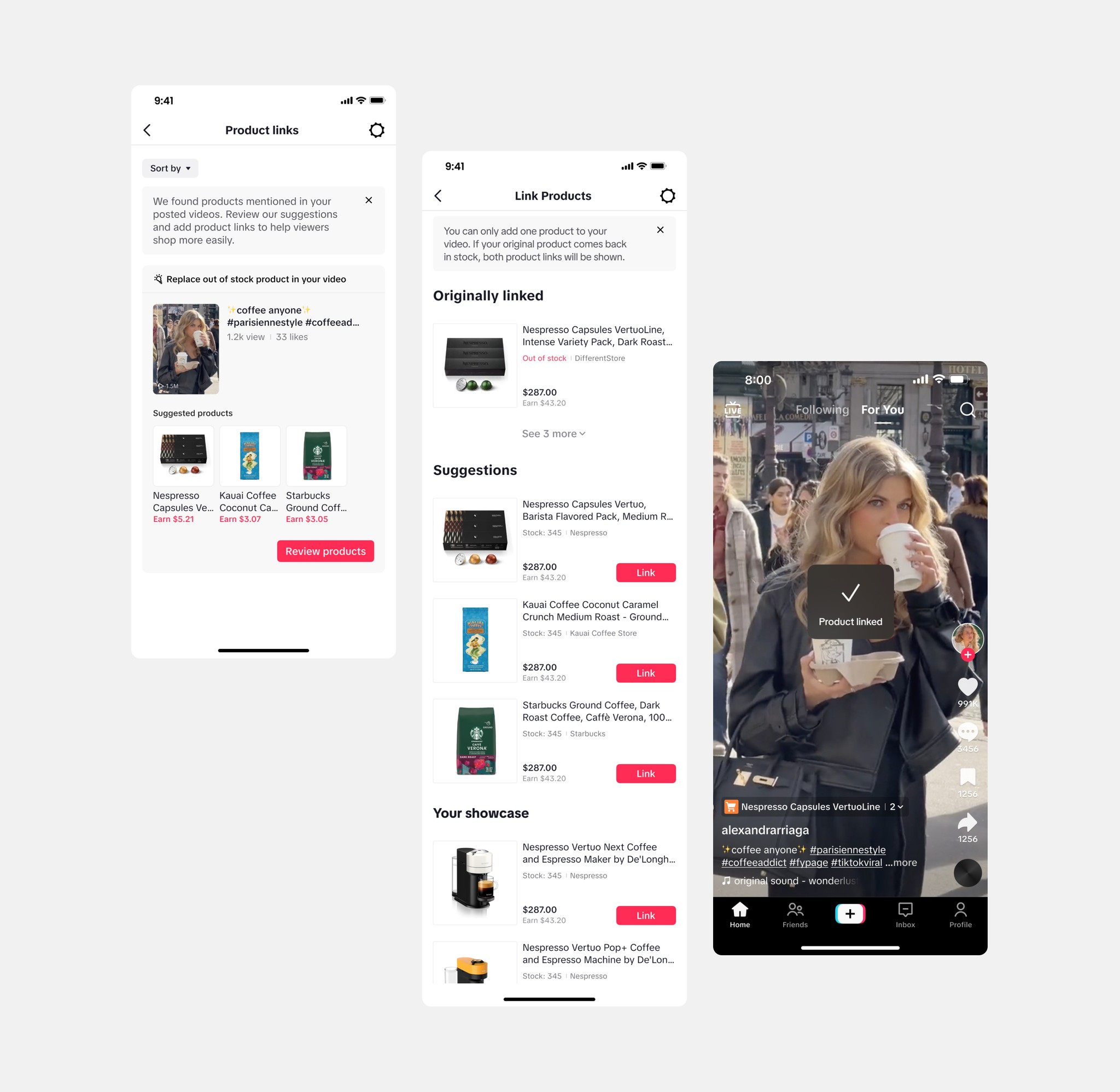
Final Proposal
Design Process
After considering user flow, I believe it is necessary to display information about out-of-stock products when users link products. Since videos may have been published a long time ago, users may have difficulty selecting suitable alternatives if they forget which products are out-of-stock. After clearly explaining the design rationale to the PM and development team, this became an additional design point beyond the original scope and was incorporated into the project.
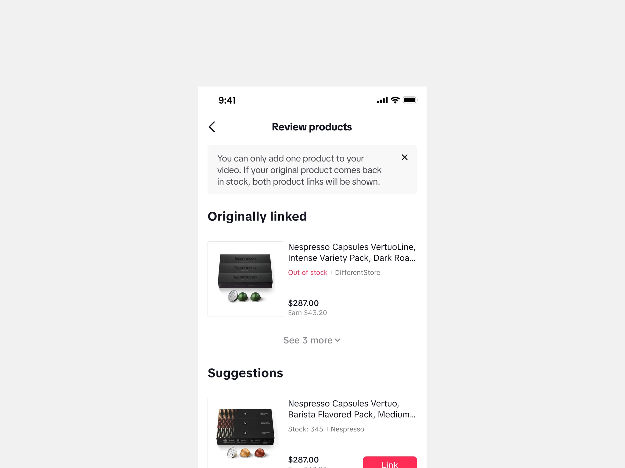
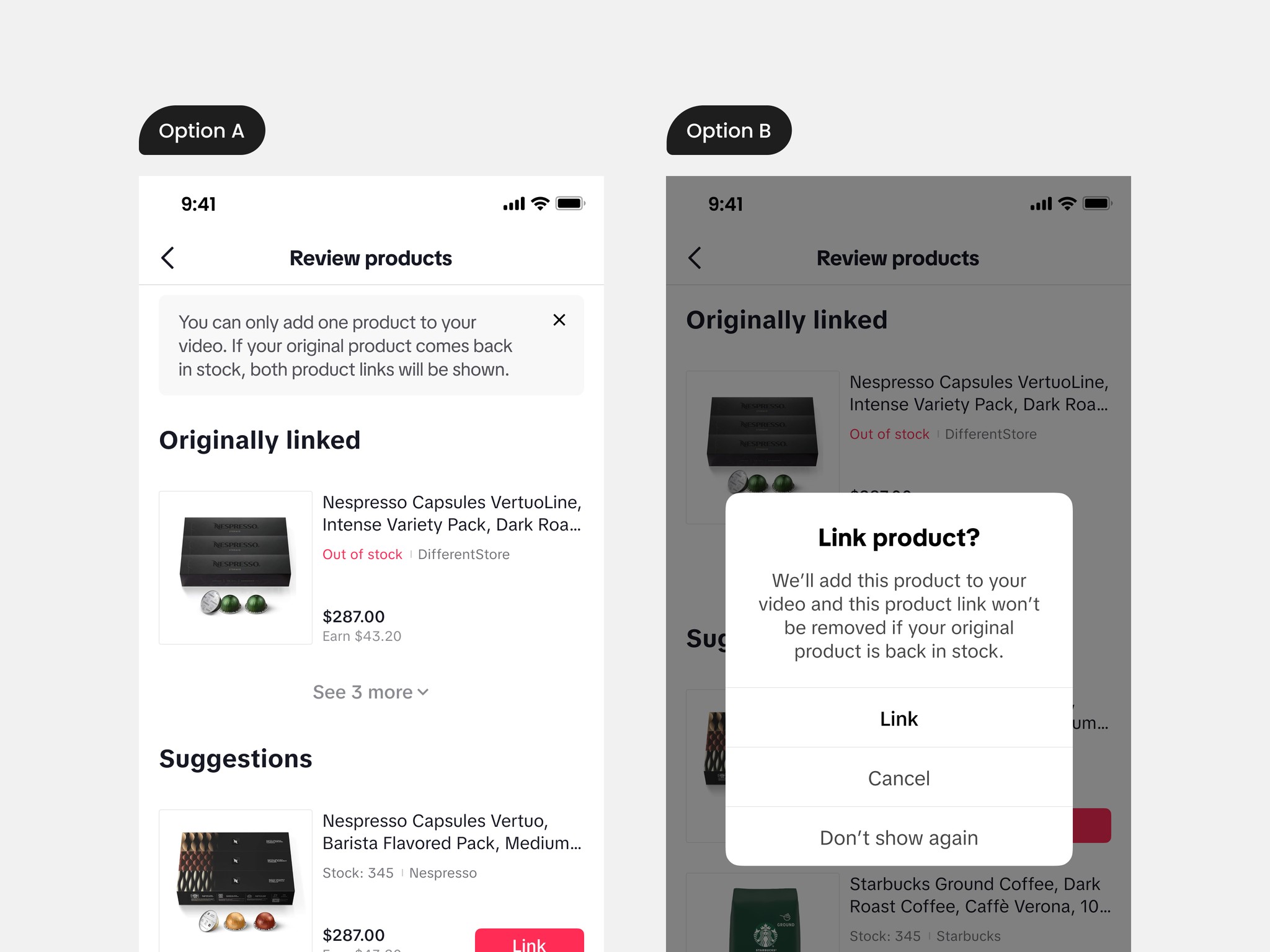
To clearly explain the rules to users, I explored two methods: notification banners and pop-ups. Ultimately, I chose the notification banner (option A), since option B significantly disrupts the user's product selection process, which is unnecessary in this case. Additionally, when users enter this interface, they will first notice the banner due to the top-to-bottom reading order, understand the rules, and then begin making their selections.
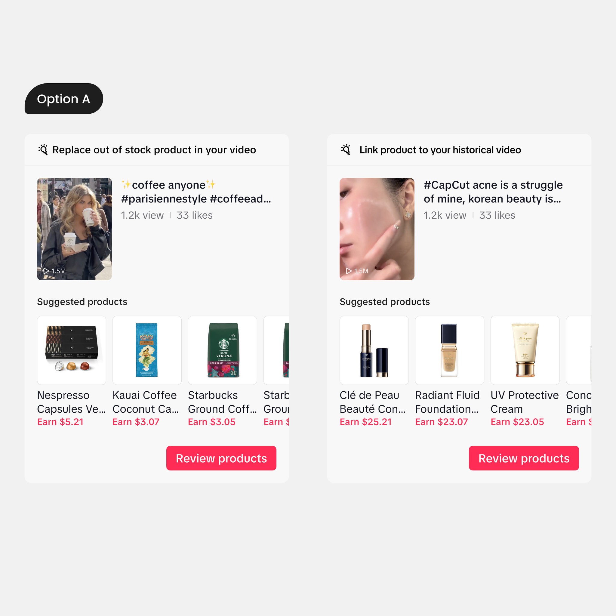
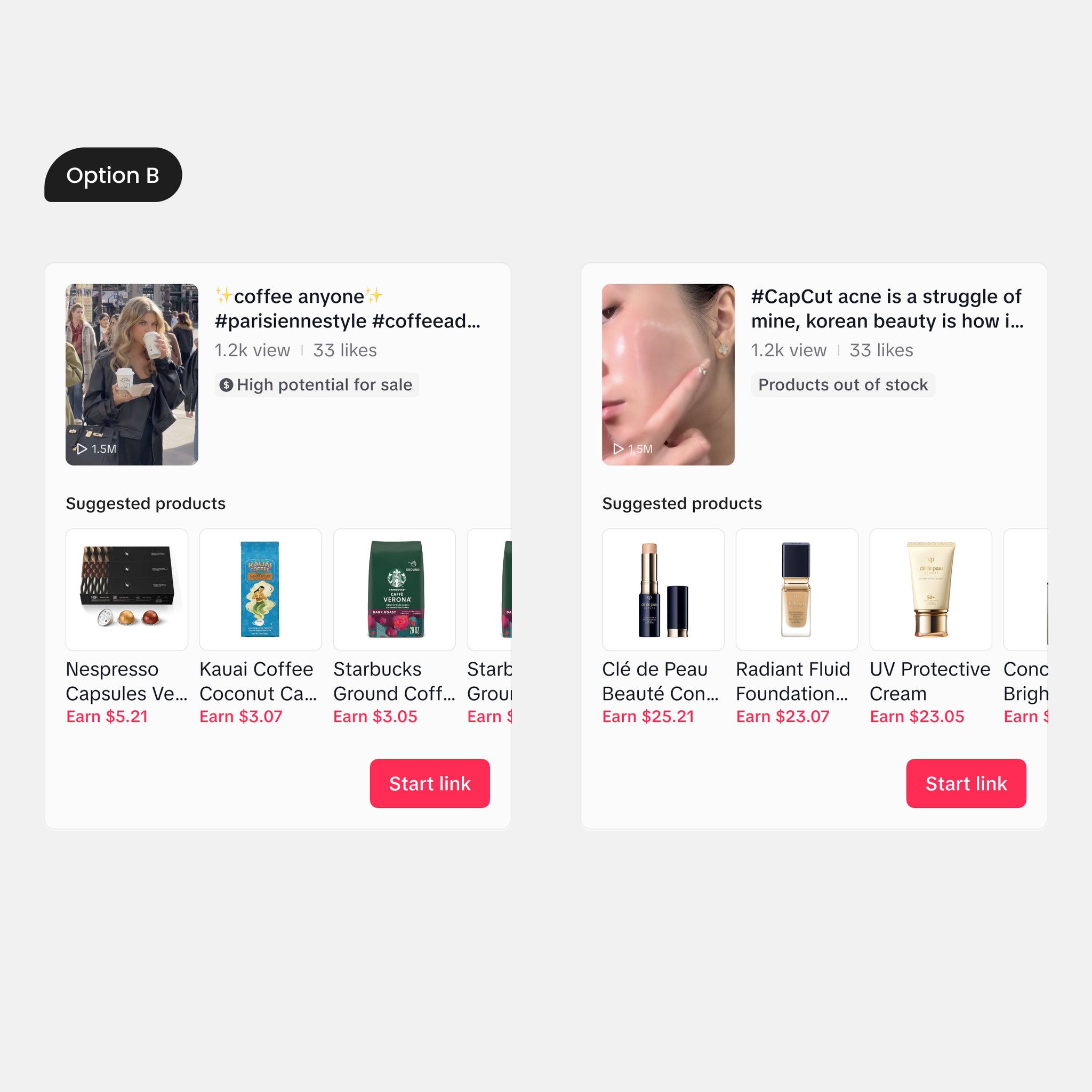
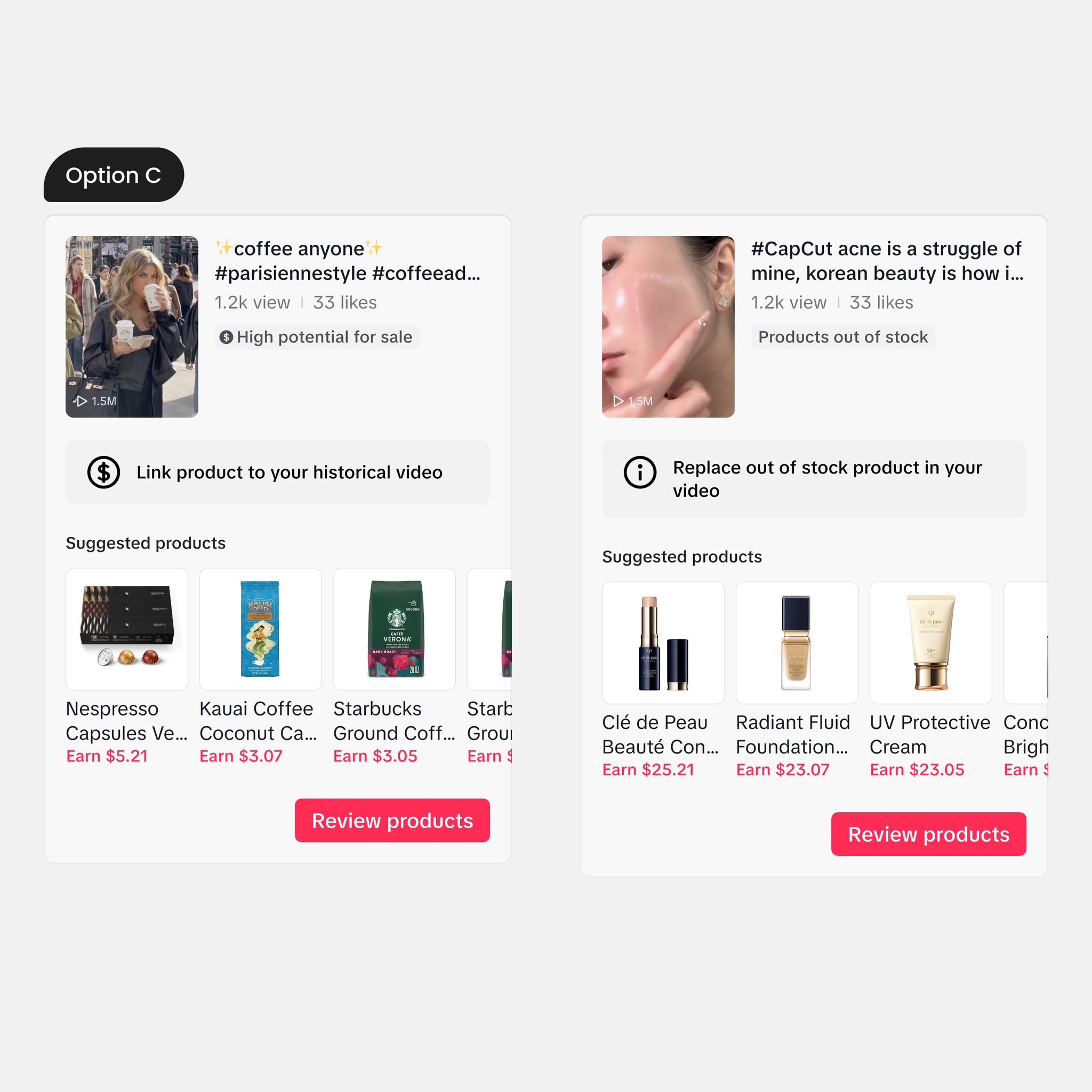
To better communicate the types of video cards to users, I conducted multiple design explorations. My goal was to make the information structure of the cards clearer with minimal changes to the existing video cards, so users would immediately understand what actions to take upon seeing the information. I chose option A because it presents the information clearly without adding other UI elements to the page.
User Feedback
To ensure the project better achieves corporate objectives and meets user needs, I strongly recommend that the PM conduct user testing. The focus of the testing should be:
Whether creators have any additional concerns about this feature
Whether creators can understand the design
After conducting user testing with 8 participants, including creators and sellers, we obtained the following key findings:
All 8 participants found the design very straightforward. 🥳
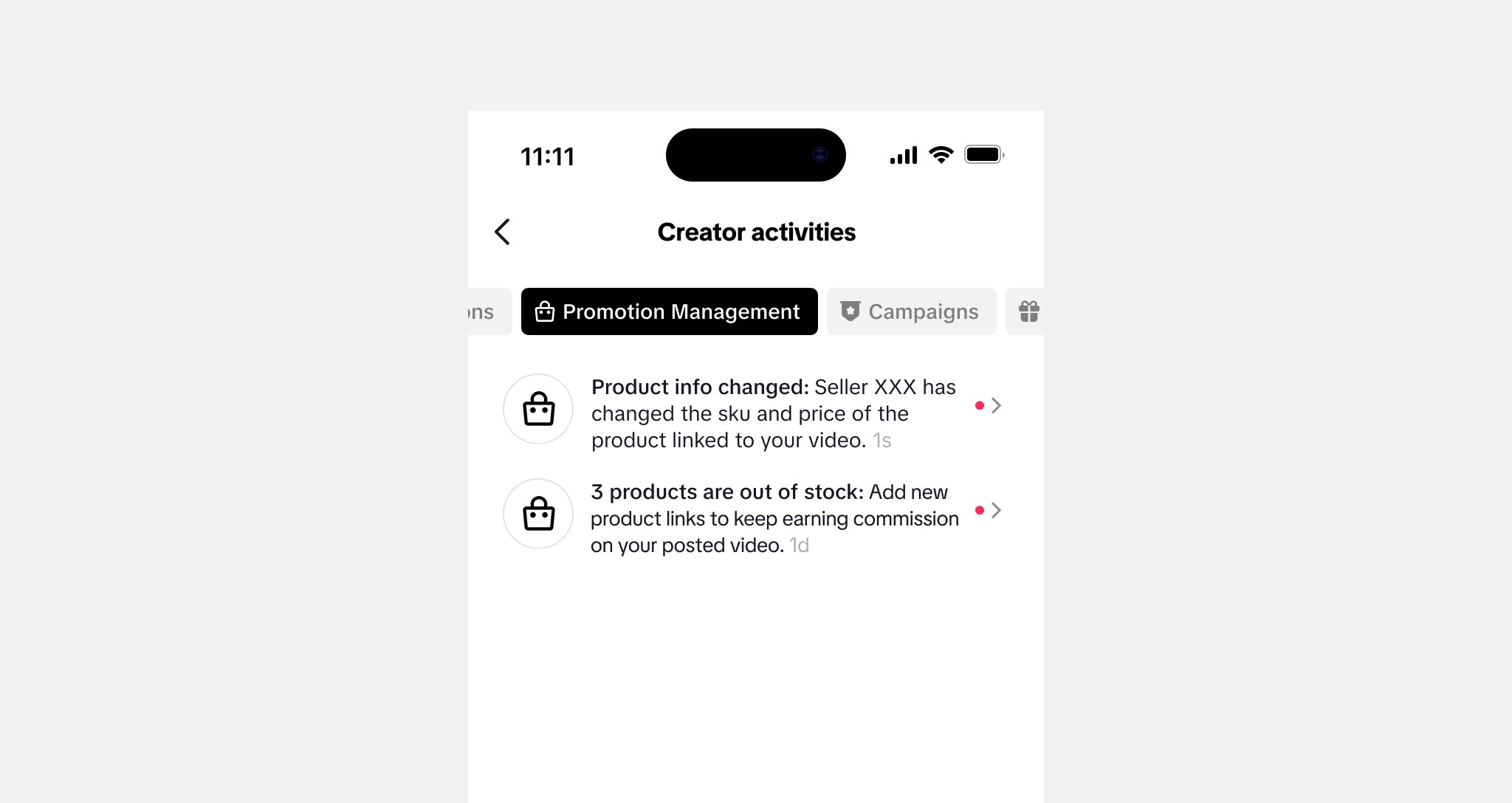
4 out of 8 participants were worried about they cannot read notification timely because there are too much.
To address the second concern, I designed the push notification logic with PM, and the notification style.
